
This case study illustrates the redesign process of the CasaOne Payment page, strategies employed to enhance the user experience and a user-centered design approach to eliminate user pain points and optimize the conversion rates.
Project Overview
Project Type: Company - Team
Duration: 2 weeks ( Jan 2023)
Role: UX Researcher, UX/UI Designer
Tools: Figma
As a UX designer at CasaOne, I spearheaded the revamp of the entire CasaOne checkout pages, which led to an impressive 12% increase in checkout rates. This case study details the specific changes made to the Payment page design, including improvements to the layout, color scheme, and overall visual design, and how the redesign effectively addressed user pain points, resulting in an intuitive, visually appealing, and high-converting checkout experience.
Starting Point & Motivation
The checkout is one of the most sensitive areas of an eCommerce store, on average 7 out of 10 carts are abandoned upon arriving at checkout. Primary reasons are:
👉 Checkout form being too complicated
👉 Unexpected charges and fees
👉 Forced account creation
👉 Lack of payment methods and shipping options
👉 Lack of trust in the store when providing credit card information
When over 74% of potential customers abandon their purchase during the checkout process, as was the case for CasaOne, it became evident that there was friction and room for improvement. Although each checkout experience can be optimized differently depending on the product and industry, I found numerous opportunities for industry-standard UX/UI improvements and identified several key areas where UX design solutions could lead to significant and impactful improvements in the checkout experience.
Initial step was to conduct a heuristic analysis of each page that a user must visit in order to finish a checkout. This was done to uncover the problems during checkout, calculate the number of clicks required to place an order and find out potential usability issues.
I did some competitive analysis to understand the common trends of a fast checkout experience.
Watched Hotjar recordings in order to understand User behavior insights, Identify usability issues and analyzed the heatmaps to identify which areas of the page are receiving the most attention and which ones are being ignored.
I performed in-depth Google Analytics research to discover the following numbers:
👉 74.62% of users, who wanted to finish their purchase, didn’t and abandoned the checkout
👉 Cart and Payment page has the highest abandonment rate
What could be improved?
1
The design looks outdated and could benefit from a more modern aesthetic.
2
The color choices are inconsistent and not visually appealing.
3
The call to action is not prominent enough, which may cause users to overlook it.
4
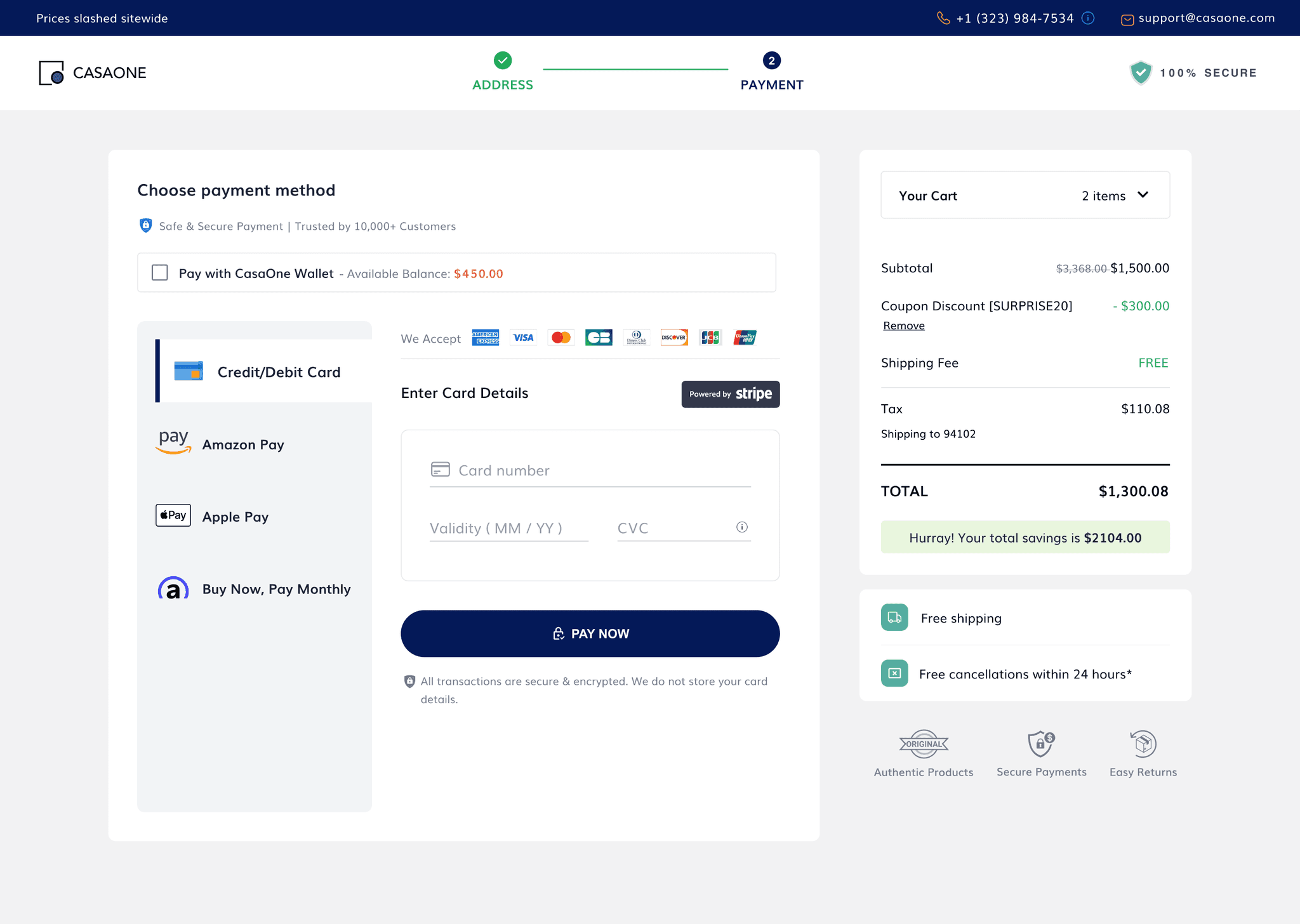
The lack of trust badges or information about safe payment may deter users from making a purchase.
5
There is no information about the types of card payment methods accepted, which can be a barrier for some users.
6
Doesn't adhere to the marketing guidelines of different payment options, which can lead to confusion and mistrust among users.
7
The navigation bar on the payment page seems unnecessary and could be removed to streamline the checkout process.
8
The card details form field lacks usability and intuitiveness, making it challenging for users to complete the task efficiently.
Enhancements made:

1
From Dull to Dazzling: How I Gave an Outdated Design a Modern & Functional Makeover
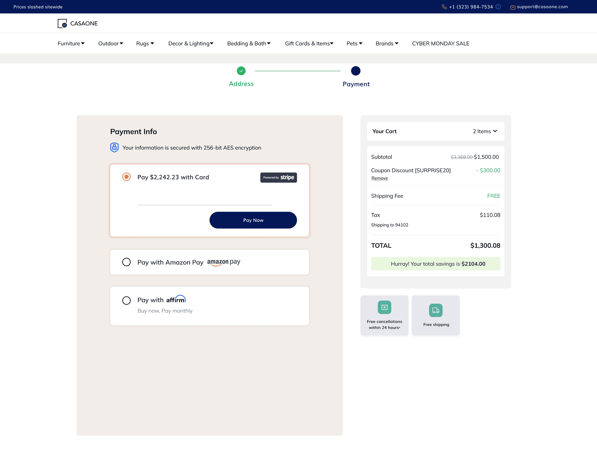
To address the outdated design of the Payment page, I conducted a thorough visual audit of the current design and identified specific elements that contributed to the outdated look. Based on my findings, I created a new visual style guide that incorporated modern design trends and best practices. This included updated typography, a new color scheme, updated imagery, and a cleaner layout that prioritized usability and accessibility. I also explored the use of modern design elements, such as animation and responsive design, to further enhance the user experience and bring a fresh look to the design. Regular usability testing and feedback sessions were conducted to ensure the design remained up-to-date and met the evolving needs of the users.
2
To improve the visual appeal of the design and create a more cohesive user experience, I utilized the brand colors throughout the design while keeping the use of other colors to a minimum. By doing so, I was able to create a harmonious color scheme that complemented the brand's identity and conveyed a sense of professionalism and attention to detail.
3
Making the CTA Great Again!
In order to address the issue of the call to action not being prominent enough, I implemented a design solution aimed at making the CTA button more visible and prominent. I used visual hierarchy principles to create a clear focal point for the button, including making it more visually striking and placing it in a prominent location on the page.
4
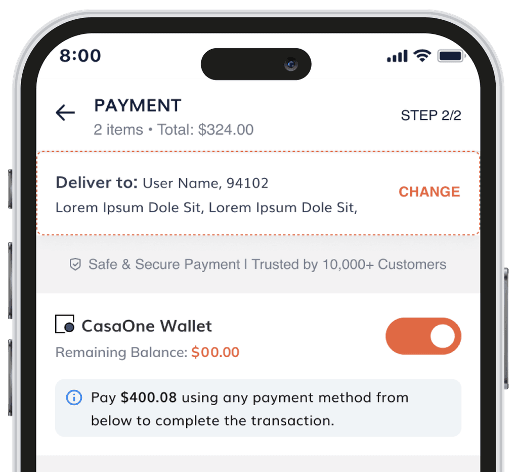
In order to address the issue of users being deterred from making a purchase due to a lack of trust badges or safety information, I designed a solution to prominently display trust signals, badges, and seals throughout the checkout process. This approach gives users peace of mind and confidence in the security of the platform they are using, ultimately leading to increased trust and completed purchases. By showing these trust signals, such as SSL and payment security certifications, users can feel assured that their financial and personal details are being kept safe. As a result, the inclusion of these trust signals is a vital aspect of any successful checkout process, helping to establish trust with potential users and encouraging them to complete their purchase.
5
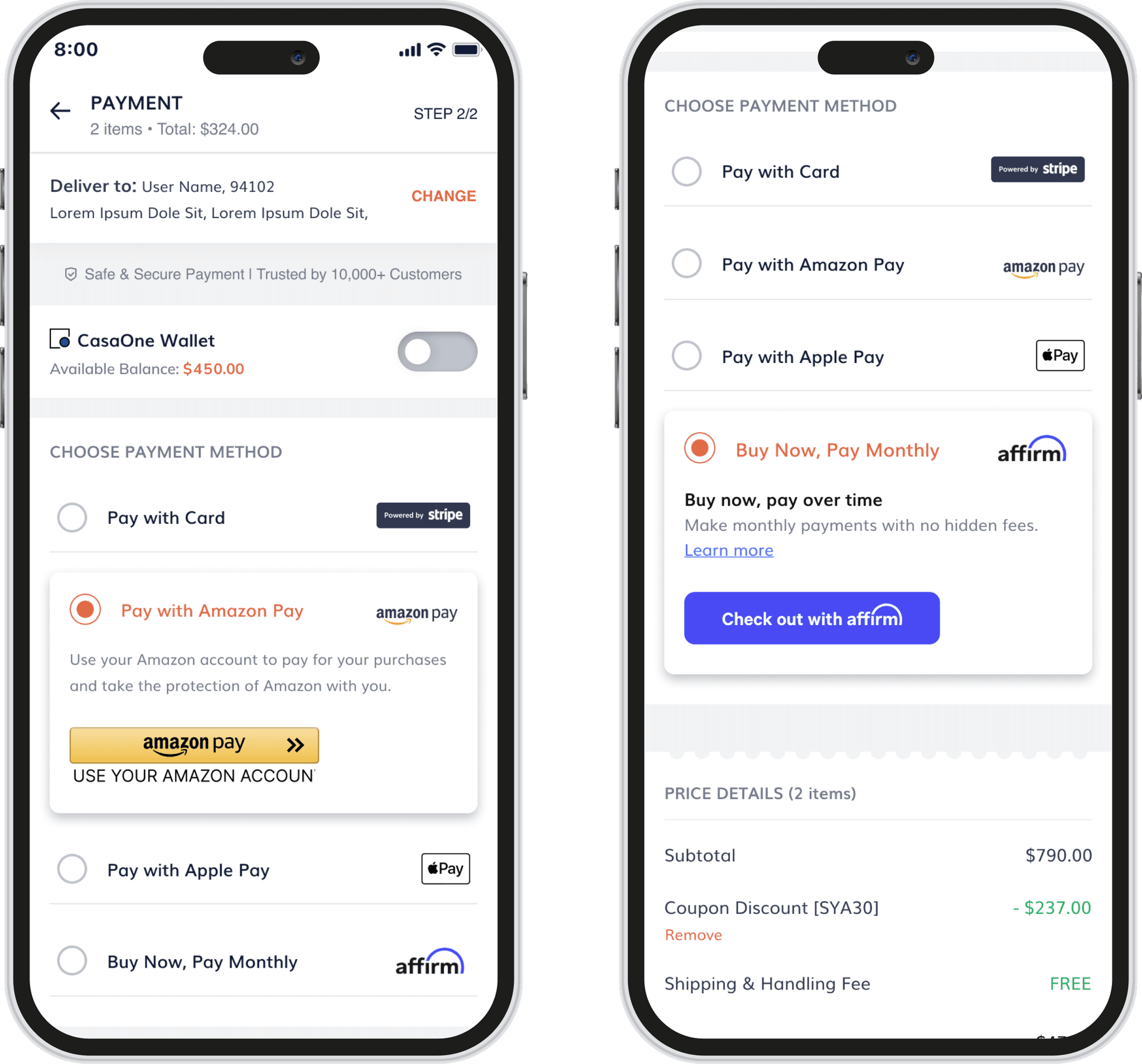
Proposed a design solution that involved adding a section on the payment page that clearly outlined the accepted card payment methods. This information was also prominently displayed during the checkout process to ensure that users could easily identify which payment options were available to them. By providing this information upfront, we were able to reduce confusion and frustration during the checkout process, ultimately improving the user experience and reducing the likelihood of abandoned purchases.
6
To address the issue of not adhering to the marketing guidelines of different payment options, I conducted research to identify the specific guidelines for each payment brand accepted on the website. Based on this research, I made design adjustments to the placement, size, and color of the logos to align with each brand's guidelines. By following these guidelines, users were more likely to trust the payment process and complete their purchases without confusion or hesitation. I also regularly reviewed and updated the payment page design to ensure compliance with any changes in guidelines, helping to maintain user trust and confidence in the payment process.
7
Nav-bar-gone: A Progress-ively Streamlined Checkout Experience
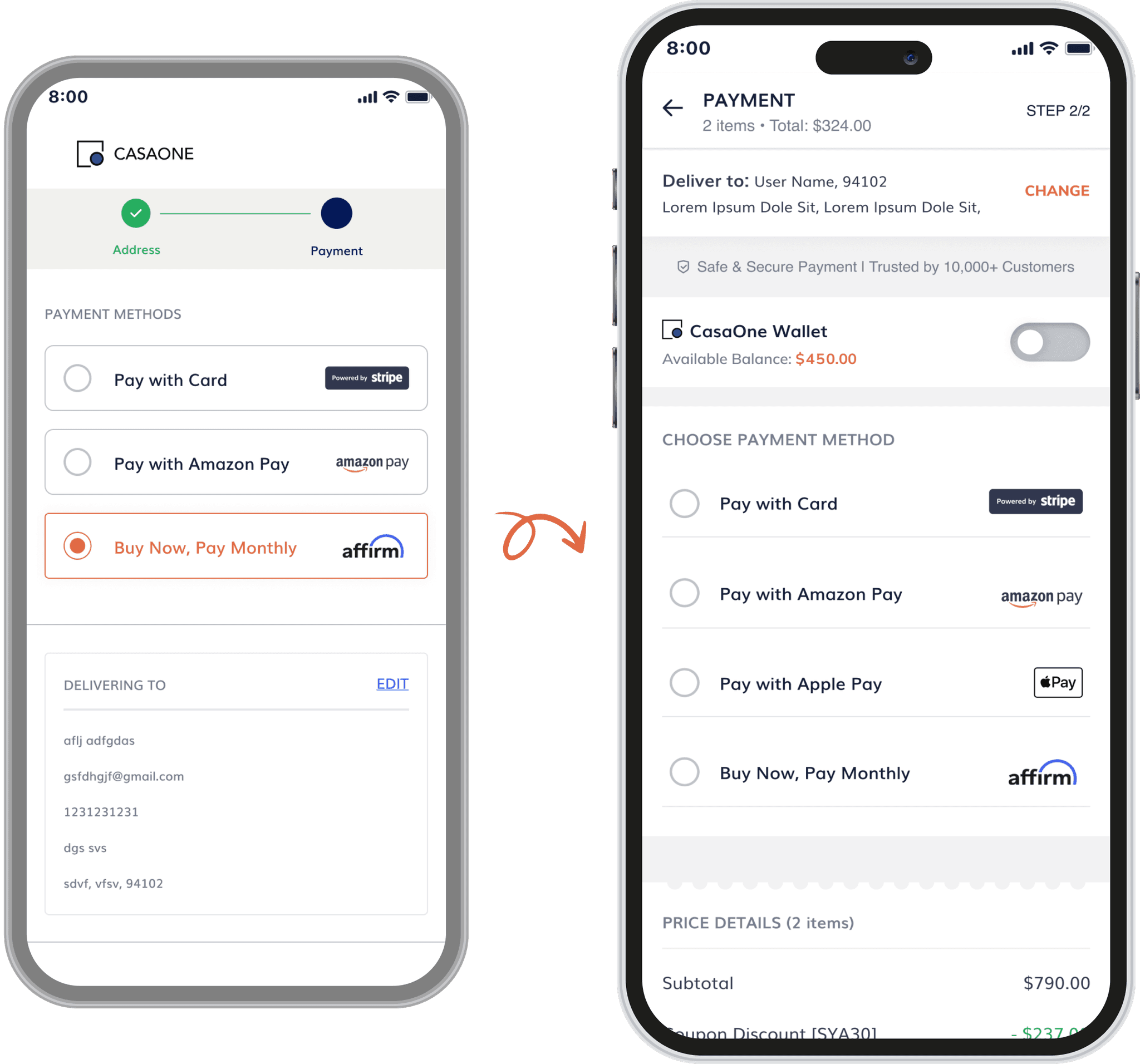
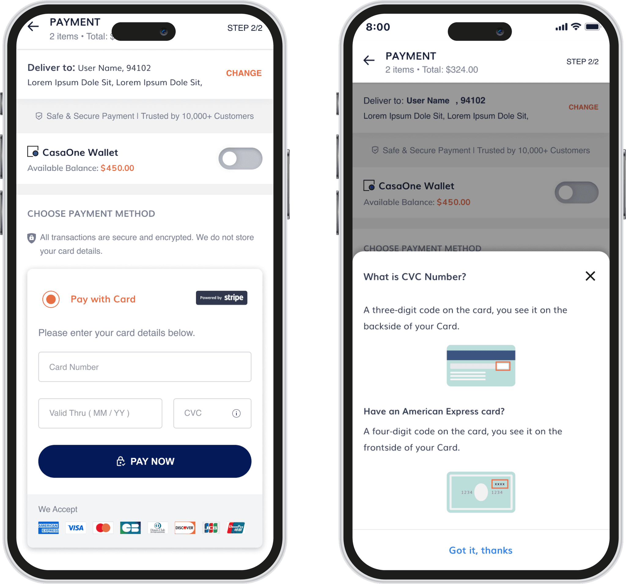
In order to address the issue of the unnecessary navigation bar on the payment page, my design solution involved removing it entirely and replacing it with a clear and concise progress bar. This helps in streamlining the checkout experience and allows users to focus on the task at hand without any distractions or unnecessary navigation options. Additionally, I provided an option to change the Address, giving users the flexibility to go back and make changes if needed. As a result, the checkout process was more efficient and user-friendly
8
A Card Trick Users Actually Like: A Card Details Form Field Fix that Even Grandma Could Use!
To tackle the challenge of the unintuitive card details form field, I implemented several design solutions. Firstly, I introduced clear and concise labels for each field in the form. Additionally, utilized input masks to guide the user in entering the correct format for each field, such as credit card number and expiration date. To provide instant feedback to the user, I added inline validation if any errors are made while filling out the details. Finally, to cater to users who may not be familiar with CVC numbers, added a tooltip icon on the CVC section, Upon clicking, a pop-up would appear, providing the user with the necessary information.
Bulls-eye! 🎯
By leveraging our design process, we successfully achieved our goal of creating a functional and streamlined checkout experience for CasaOne's customers.
What's more?
✅ We ran some user-testing on the final design and the results were very positive: the UX was streamlined, just as we wanted it. The users didn’t have any problems going through the checkout process, thus validating our hypothesis for the final design.
✅ Our team and stakeholders were impressed with the outcome, but most importantly, user-testing data showed that customers loved the new design.
✅ The streamlined UX allowed for a seamless checkout experience, eliminating any confusion or frustration for the users.
Learnings:
👉 The checkout process is a critical area for eCommerce stores, and even minor UX/UI issues can result in a significant number of abandoned carts.
👉 Conducting research, including heuristic analysis, competitive analysis, user behavior insights, and analytics research, can help identify the problems and opportunities for improvement in the checkout process.
👉 Design solutions should be based on data insights gathered from user research and feedback. This ensures that the solutions are tailored to the needs and preferences of the users, resulting in higher satisfaction and adoption rates. It also minimizes the risk of building a solution that fails to address the user's needs and misses the mark.
👉 By making small improvements in areas such as trust signals, payment methods, and adherence to payment brand guidelines, eCommerce stores can increase user confidence and encourage users to complete their purchases.
👉 Regular usability testing and feedback sessions can help ensure that the design remains up-to-date and meets the evolving needs of the users.
Key Takeaway
This project was just one of the many exciting design projects I worked on, at CasaOne, Through this case study, I aimed to showcase my design rationale and the process I followed to make design decisions, which involved gathering and analyzing both qualitative and quantitative data. This project allowed me to gain valuable insights into the importance of data-driven design solutions, user feedback, and collaboration in achieving project goals. I look forward to applying these learnings to future projects and continuing to deliver innovative solutions that meet the needs of users and business. The checkout process is a critical aspect of any eCommerce store, and optimizing it is necessary for reducing cart abandonment rates and increasing conversion rates.